Aspérité
Individual project
Gap year - 2023/2024
Credits: Helvetica by
Max Miedinger and Eduard Hoffmann.
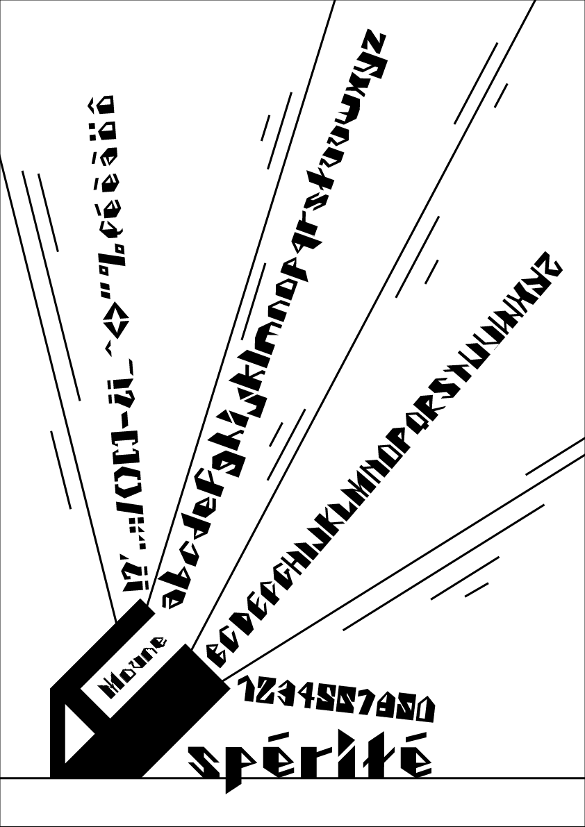
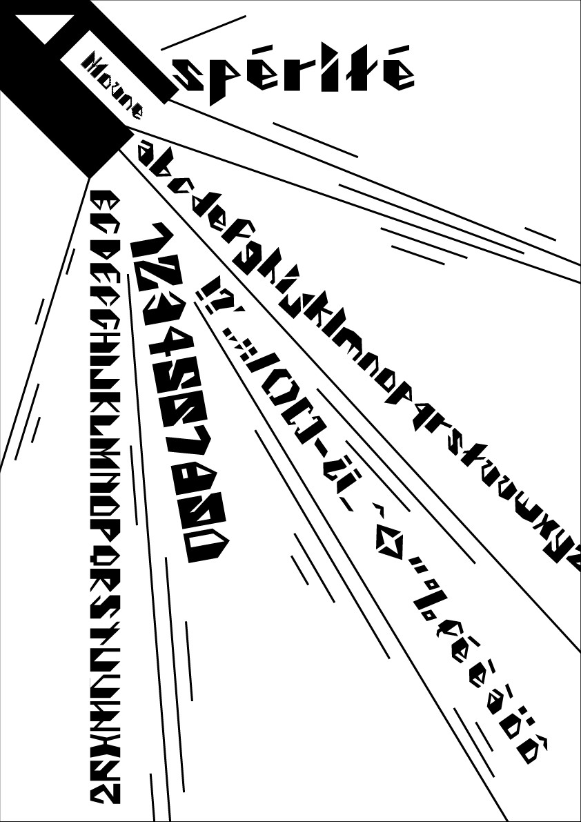
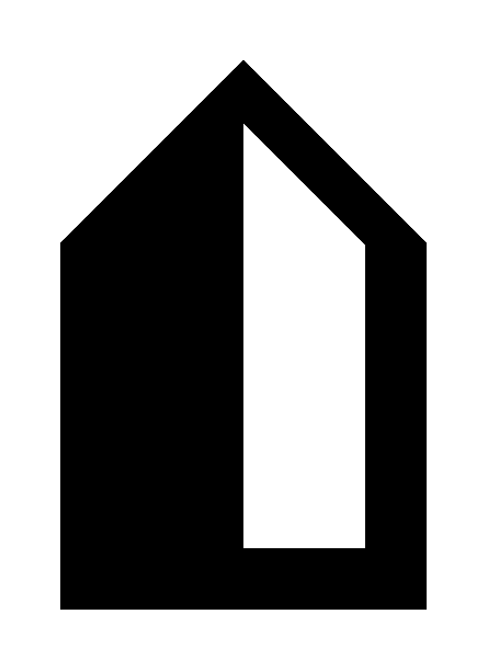
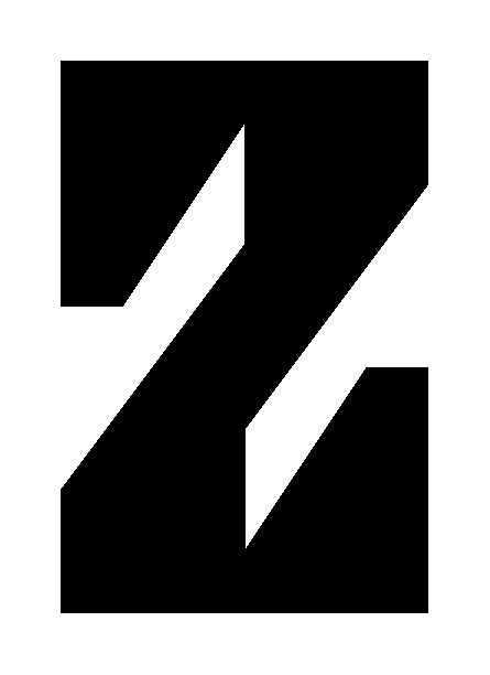
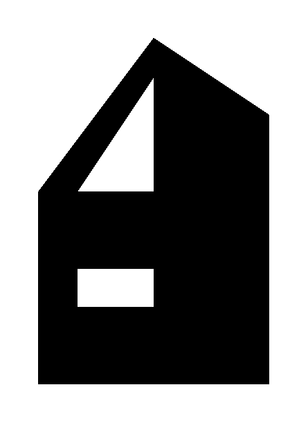
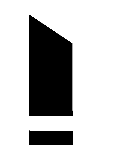
Aspérité is an avant-garde typographic endeavor that defies conventional symmetry while embracing geometric principles. In this project, the deliberate imbalance in character design is coupled with precise geometric construction, resulting in a visually striking and dynamically asymmetric font.
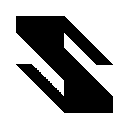
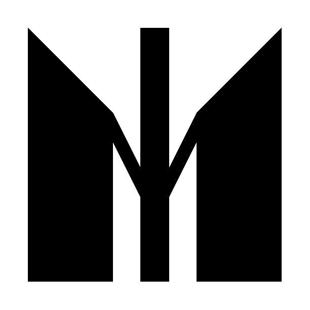
Each letterform in Aspérité is meticulously crafted with geometric precision, with one side deliberately weighted to create an intriguing visual tension. This fusion of asymmetry and geometry imbues the font with a sense of order amidst the apparent imbalance, adding depth and sophistication to the typographic composition.
The completion of the Geometric Asymmetry Font Project marks the culmination of extensive research and brainstorming sessions. This font's development required a significant investment of time and effort to strike the perfect balance between asymmetry and geometric precision.
Link to the video ︎︎︎

